 |
 |
 |
 |
 |
 |
 |
 |
|
|
|
|
|
|
|
|
Brief DescriptionIntroduction to the art, science, and practice of using interactive computer graphics techniques to provide insight into and/or reveal important patterns and structure in large multidimensional, multivariate, time-varying data sets. Human perception; perceptual color spaces; visual variables; missing and/or dirty data; uncertainty modeling and visualization. In addition to the mathematical and computer science concepts you would expect, effective visualizations rely upon a basic understanding of the psychology of human perception. Prerequisites
|
Data is all around us. It's massive, distributed, and growing exponentially. It may be scientific data gathered from measurements and experiments. Remotely sensed data from satellites in orbit, planes, and/or other terrestrial vehicles. It may be data gathered from social networks. Data generated by some sort of simulation. Financial data. Surveillance data. Performance data. … The list goes on and on.
The purpose of gathering data is to gain insight from it and use that insight in some sort of decision-making process. No matter the organization with whom you establish a career, there will be a need to gather, analyze, and visualize data.
This course covers several key topics related to the theory of visualization, including: human perception; visual encodings and visual variables; the importance of understanding task-based effectiveness of specific types of visual encodings; and others. It is also a project-based course in which students design visualizations based on these theoretical concepts and deal with related real-world issues such as: missing and/or dirty data; developing interactive exploration tools to help locate and reveal unknown structures and patterns in the data; and uncertainty in data analysis and models.
Primary Text
A Seminal Reference Text
Other Reference Texts
Visualization is a very broad area of study. To be sure, any time we create a picture, we are "visualizing" something. Nevertheless there is an important distinction between using computer graphics for data visualization and using it to create, say, an image of a house. Generally speaking, visualization applications are fed data – generally a very large amount of data – and one very important goal is to understand what the data means by looking for objects, patterns, relationships, or other structures in and among the data. The goal of extracting insight from the data is sometimes to support decision and policy making, and sometimes to better understand physical, social, economic, or other processes. Using visualization in this way is increasingly viewed as a powerful tool for data mining.
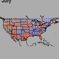
The data is frequently multidimensional, multivariate, and/or time-varying. One of the significant research challenges centers on the search for effective means of conveying in an intuitive fashion the multivariate nature of the data. For example, how can we present information like the following in a single display that captures how the data varies over a large geographic region and is easily understandable by officials who need to make policy decisions based on an understanding of this data?
Several very nice techniques for such multivariate data visualization challenges have been developed and published, but much is yet to be done!
This is an exciting time to be doing visualization research. The field has significantly matured in terms of theoretical underpinnings and practical use. There is an annual IEEE Visualization Week event that has become the premier venue for presenting new results. There are three common research threads that have emerged, and these three are each highlighted with their own conference/workshop portion of Visualization Week: Information Visualization ("InfoVis"), Scientific Visualization ("SciVis" or just "Vis"), and the relative newcomer Visual Analytics Science and Technology ("VAST"). Some basic characteristics of these are described below. While the distinctions are relatively clear, there are not sharp boundaries between them. Moreover, it is difficult to study or work in any of them without using techniques and results from all of them. As a result, all three are covered to varying degrees in this course.
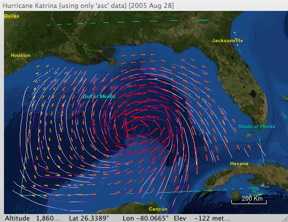 |
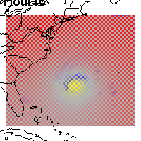
| Hurricane Katrina: Using color to visualize rainfall on wind flow lines while using color redundantly with arrow glyphs to visualize wind velocity vectors |
In addition to relying heavily on computer graphics technology in general, visualization is concerned with a host of other issues related to data representations, efficient distributed processing and data management, parallel processing (e.g., GPGPU programming), data analysis and filtering, and how humans perceive and understand images they see – all in the interests of supporting the creation and highly interactive manipulation of effective visual abstractions of data and relationships among data. Oftentimes it is not clear in the beginning how best to display the data in order to extract the insight we seek. The visualization enterprise necessarily involves a searching process, and to maximize the efficiency of this process, we require highly responsive interactions with our data and its visualization.
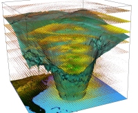
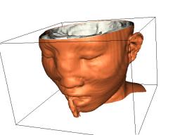
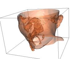
In one sense, a typical data set is just a bunch of numbers. They may be simple scalar values like densities, pressures, temperatures, absorptions, etc. They may also be n-tuples, consisting of several scalar values like those just mentioned and/or geometric data like points and vectors. Sometimes the data is clearly associated with a real physical object: CAT-scan data of a human head, stresses in a beam, wind velocity vectors associated with a hurricane somewhere in the world. Other times the data has no meaningful spatial connection at all: exchange rates, stock prices, demographics of a population. Techniques for the former are generally described as "Scientific Visualization" tools, while those for the latter are more often described as "Information Visualization". Somewhat more precisely:
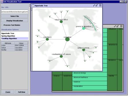
The distinction between scientific visualization and information visualization is not always a sharp one. It is not uncommon for techniques proven to be useful in one domain to be found to be useful in the other as well. In addition, scientific visualization applications frequently employ multiple graphical display windows, some of which are more "InfoVis" in nature than "SciVis". Conversely, information visualization applications sometimes have natural spatial contexts like that shown below.
When an information visualization application has no natural physical "object", one of the first important tasks is to assign non-spatial attributes to spatial axes – something that is rarely an issue in Scientific Visualization.
As the various fields of visualization have matured, it has become increasingly apparent that – because the underlying motivation for visualization was to understand large data sets and make appropriate decisions and/or hypotheses based on that understanding – attention should be focused on the how visualization techniques can best be used for analysis. As a result, the field of Visual Analytics Science and Technology (VAST) has emerged as "the science of analytical reasoning supported by highly interactive visual interfaces". Among other things, there is an emphasis not only on how visualization can be used to present scientific results, but also (and more significantly) how it has become an integral part of the scientific discovery process itself.